July 19, 2025
UX Design Psychology: 7 Hacks Backed by Science

Psychology-backed UX hacks OpenAI, Apple, and Uber use to make products irresistible.
Let’s be honest: Most products are meh.
You click. You scroll. You leave.
But every once in a while… you use something that just gets you.
It feels intuitive.
Thoughtful.
Even a little magical.
Why?
Because the best products aren’t just functional.
They’re likeable.
And often, that’s not an accident.
UX Design Psychology: What Bad Products Get Wrong About Human Behavior
Great design isn’t just about clean buttons and nice colors.
It’s about psychology.
When you understand how people think, feel, and behave, you can create experiences that connect on a deeper level.
Why the psychology of UX design matters
I’ve always been drawn to art and design.
Ever since I can remember, I’ve looked at products with a sense of curiosity, wondering what makes them feel good to use or why some designs just click.
That curiosity led me down the path of learning what makes great design truly work.
And now, with AI becoming such a big part of how we build, I believe the real advantage will come from something deeply human: our taste and our ability to connect.
That’s why I think understanding UX design psychology is one of the smartest things you can invest in in these times. So today, I want to share 7 UX psychology principles that I’ve learnt from the world’s best brands.
And yes, you can use them too.
Let’s dive in.
UX Design Psychology: 7 Hacks Backed by Science
1. Show What’s Happening
The Principle of Operational Transparency
Ever notice how Uber shows you the driver’s route in real-time?
Or how ChatGPT’s new agent now visibly shows what they’re doing as they work?
That’s operational transparency at work.
While the newly launched OpenAI agent is working, it gives you a live narration of its process. It shows which websites it’s visiting, what it’s looking for, and why.
You can even interrupt it mid-task to clarify or add something new, just like you would with a teammate.

It feels natural and collaborative. And that’s exactly the point.
As OpenAI put it, the goal is to mirror how you’d interact with a real human who’s helping you out: checking in, asking clarifying questions, and keeping you in the loop.
When people get a little peek behind the scenes, they feel more in control, more involved, and a lot more patient.
You don’t need to be building a product to use this.
You can apply it in everyday work.
If you’re in the middle of something, just share where you’re at.
A quick update helps others feel included and eliminates that awkward guesswork.
💡 Try this: Add status updates, typing indicators, or micro-progress bars. Narrate the process. Keep people in the loop.
2. Make it Beautiful
The Principle of Beauty
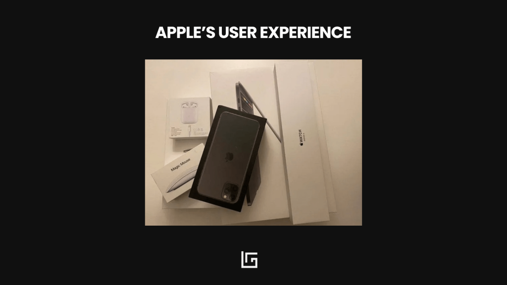
Here’s the truth: We judge books by their covers.
Beautiful things feel high-quality, reliable, and worth our time.
In UX, beauty isn’t just about aesthetics.
It’s about creating a sense of clarity and flow.
One of the best ways to do that is by using a design system.
A design system is a set of rules and components that keep everything in your product consistent: things like your color palette, typography, button styles, icons, and spacing.
It’s basically your visual language, and when used well, it creates harmony across every screen.
Apps like Revolut or Airbnb use design systems to create clean, intuitive experiences that feel effortless.
You don’t see five different font styles or ten types of buttons.
Everything works together.
It kind of feels calm and it’s easy to use.
💡 Try this: Always start with your design system. Choose your main colors and fonts. Define how your buttons and forms should look. Stick to consistent spacing and layout rules. When you reduce visual noise, people can focus on what really matters.
Beautiful design shows care, and care builds likeability.
3. Remove Friction
The Principle of Least Effort
We’re all busy and lazy.
If something takes too long, we’ll ditch it.
Smart brands like Airbnb know this.
That’s why they:
- Auto-fill info
- Suggest dates
- Make booking feel like magic
They design for effortless.
💡 Try this: Look at your user flows. Where are you making people think too hard or click too much? Simplify it.
4. Don’t Overload
Here’s a quick brain fact.
We can only hold around 7 things in our short-term memory.
Sometimes less.
This is called Miller’s Law.
So what happens when your product shows too many options at once?
People freeze. They don’t know what to do next. And they leave.
Think of a menu with 12 links. Or an app that explains everything on the first screen.
It feels like too much. And overwhelm leads to drop-off.
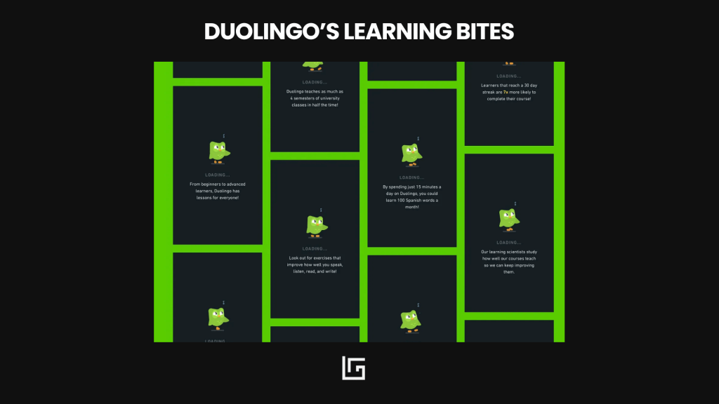
The team at Duolingo knows this well.
They show you just one lesson at a time. One goal. One screen. Simple.
💡 Try this: Break things into steps. Group similar items together. Keep each screen focused. Help users move forward without thinking too hard.
5. Keep People Engaged
People don’t just hate waiting.
They hate feeling like nothing is happening.
This is called idleness aversion.
We’re more comfortable when there’s movement, even if we’re not in control.
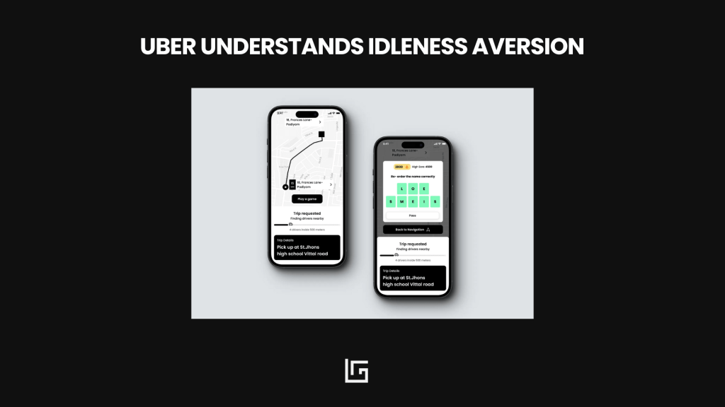
Uber figured this out.
When they started showing the driver’s live location, people felt better.
They weren’t just waiting, they were watching progress.
Apps like Lovelable take it further.
They show progress bars, helpful tips, or fun facts during loading.
These little moments make the wait feel thoughtful instead of frustrating.
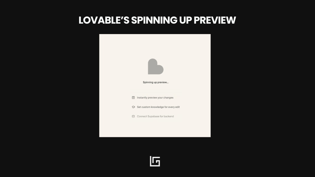
💡 Try this: Show something during slow moments. A progress bar. A kind message. A useful fact.
6. Design the Moments That Matter
We rarely remember every detail of an experience.
What we do remember are two key moments: the peak and the end.
This is called the Peak-End Rule.
The team at Spotify masters this rule.
Think about Spotify Wrapped.
You don’t remember every playlist you made.
But you do remember the moment they told you your top artist of the year, wrapped in bright colors and playful animations.
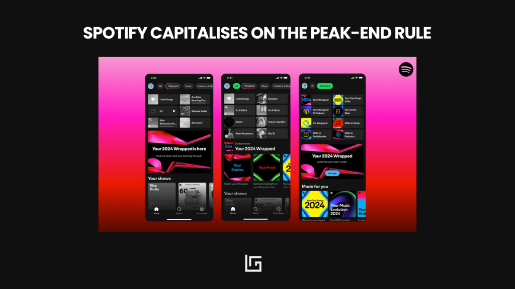
That’s a peak.
You can bring this into UX too.
Think about how Duolingo gives you confetti and a streak count after a lesson.
Or how Notion celebrates your first workspace setup with a short, encouraging animation.
These emotional peaks make users feel good.
💡 Try this: Engineer for the Peak-End Rule. Work intentionally on the last moments of your experience — and design one emotional highlight users will remember.
That’s how you turn function into feeling.
7. Make It Personal
The Principle of Identity
People don’t just use products.
They use them to express who they are.
That’s why you hear things like:
“I’m an Apple person.”
“I drive a Mercedes”
We all want to belong.
To feel part of something bigger than ourselves.
Smart products tap into this.
They help people connect their identity with the brand.
This kind of connection builds pride and turns users into advocates.
💡 Try this: Use language that reminds them who they are, and why what they’re doing matters. Let users personalize their space.
Design with identity in mind. Because when people see themselves in your product, they’re more likely to stay.
UX Design Psychology matters
People don’t fall in love with features.
They fall in love with feelings.
So if you want your product to be more than just usable, if you want it to be likeable:
Start with psychology.
Design for transparency, beauty, ease, simplicity, engagement, trust, and identity.
Design for humans.
Join the newsletter
Practical insights on AI, leadership and innovation — every week.